Some things cannot be let go. Once seen, they can never be unseen and they exist in my psyche like a grain of sand in an oyster (but without the pearly end product).
Case in point. At Wrigley Field, home plate is not lined up with the center of the backstop area.
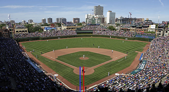
I’m sure there’s a reason. A really good reason. There must be, else I’d go insane. I don’t bother to look it up, though, because if I can’t find the reason thinking about it will consume me. I just pretend like there’s a perfectly valid explanation and fixing it is impossible.
Then, last week, my Dodgers went to St. Louis and I was forced to once again confront this.
THAT I.
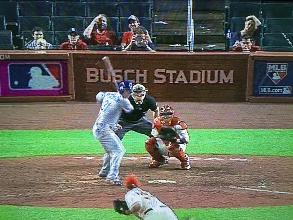
The new Busch Stadium opened in 2006. I don’t know if “Stadium” was so screwed up then, but I know it’s been that way since last year’s playoffs. I think it’s been wrong for more than two years. What the hell, can’t anyone in St. Louis SEE that!? Are there no designers there? No typographers? Who also watch baseball? Seriously.
In this case, I assume some catcher trying to run down a pop foul smashed headlong into the sign and broke it at some point. But why isn’t it fixed yet? Why has no one at the Anheuser-Busch company called to complain about how their presumably tens of millions in naming rights payments are being abused like this. HAVE THEY NO EYES?
Besides the I being screwed up, the kerning in the rest of the word just looks off to me. I get that T, A, and D all being up against one another is a challenge, but really? That’s the best we can do? “Busch” appears perfectly done. “Stadium” is kind of a train wreck, even trying to look past the skewed I.
It’s maddening.
For comparison purposes, the Dodgers found themselves in another stadium carrying a beer name right after their series against the Cardinals. In this case, Coors Field.
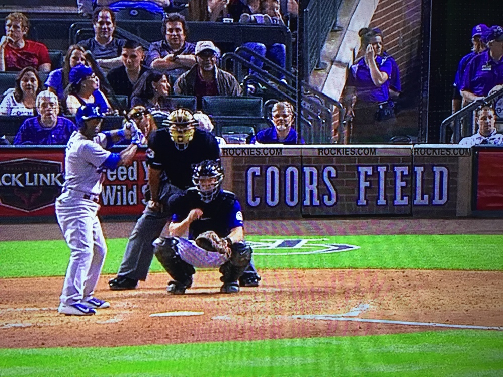
Their sign is split in two places by a damned door but the kerning looks perfect. I mean, it’s a weird really 90’s-looking typeface, but the execution is spot-on.
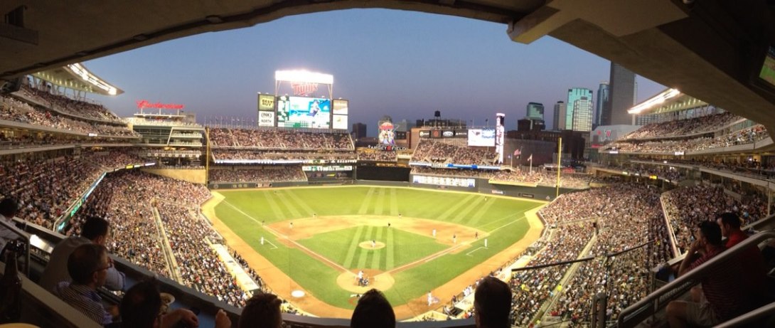
Target Field also has its name behind home.

“Target” is also a tricky word with an A under a T and next to an R and its vertical stem, but choosing to use a looser track on the letters makes it look less awkward. Had they chosen a slightly smaller type size in St. Louis or given the word mark a bit more space, the designer there could have done the same as in Target Field. But no.
And now, we’re all stuck looking at it.

You must be logged in to post a comment.